
8 Designer Home Interior Styles Worth Knowing in 2026
Explore 8 designer home interior styles for 2026, from Biophilic to Japandi, with materials, layouts and practical tips for planning your own space.

You can hand two people the same reference photo and get two different houses. One reads "natural" as oak, linen, and a view. The other reads it as a white room with a single branch in a vase. A designer home interior only holds together when the materials, the layout, and the palette are decided on purpose, then checked against the room you already have.
That check matters because most projects are remodels, not empty sites. Renovation and remodeling represented 47.85% of the global interior-design services market in 2025, while residential clients accounted for 57.39% of market revenue, per Mordor Intelligence. Walls, windows, and ceiling heights are already set. You're changing surfaces and furniture inside a frame that still has to price and build correctly.
Say the living room faces a neighbor's wall and the brief still says "bring the outside in." That's a layout problem, not a plant problem, and it shows up in the first test, not after the stone is cut. I use the eight styles below as decision tests, not posters. Each one names the palette that makes it convincing, the layout logic that keeps it from looking staged, and a comparison to run before anyone orders material.
1. Biophilic Design
Daylight does more here than a large plant in the corner. Biophilic design ties the room to living systems through views, operable glass, timber, stone, and fiber, so the interior feels connected to a garden rather than decorated with one. The Amazon Spheres in Seattle, designed by NBBJ, show the idea at civic scale: planted volumes, filtered light, and a route that keeps you among greenery. At home, the same logic is a bank of operable windows, a timber floor, and planters set on the sightline to the yard.
Health is already driving real projects, not only wellness branding. Among homeowners updating because of a life event, 21% cited health or accessibility needs, according to the 2025 Houzz renovation study. A clear path to the glass, slip-resistant floors near wet zones, and light you can tune will serve that brief without turning the room clinical.
Practical rule: Fix the window and the route first. Plants and finishes come after the sightline works.
Palette and the test
Keep three materials and repeat them: one wood, one stone, one fiber. A fourth species usually reads as a showroom, not a house.
- Daylight first: Compare two or three window and planter layouts on the same camera so you can see what the glass reaches.
- Materials second: Use a material reference against that fixed layout to swap wood, stone, and fiber without moving the walls.
- Time of day: Render morning and late afternoon. A limewashed pier that glows at noon can go flat once the sun leaves the facade.
For a longer planting and furniture sequence, these step-by-step biophilic decorating tips pair well with a concept set like the design concept examples you can put next to the source photo.
2. Japandi
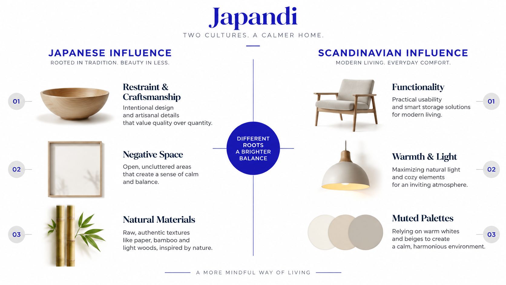
Japandi is Japanese restraint combined with Scandinavian practicality. Negative space, crafted joints, and a low horizon come from the Japanese side. Warm light, storage that works well, and pale timber come from the Scandinavian side. A convincing room is quiet, not empty. Oak floors, a low wooden sofa, and a paper pendant over a single table are enough. Retail floors from Japanese and Scandinavian lifestyle brands use that same short list, which is why a living room piled with both "zen" objects and hygge clutter fails the style.
What to repeat, and what to swap
Lock three or four materials and run them through every room you can see at once. Oak, linen, off-white plaster, and blackened metal is a full palette. A navy accent wall breaks it.
Layout stays low and open at the center, with storage pushed to the perimeter so the floor reads as one plane. Don't float a tall bookcase in the middle of that plane.
- Color and material together: Set both reference roles so a warm neutral scheme doesn't drift when you regenerate.
- One object at a time: Mask the sofa or the rug and swap it. Re-rendering the whole room invites new proportions you didn't approve.
- Texture check: Upscale the final frame until linen weave and wood grain are readable. If they smear, the client can't approve the cloth.
Say you're choosing between a low oak bench and a skirted sofa. Mask only that piece, keep the paper pendant and the floor, and pick the version that still leaves walking space on both sides.
3. Organic Modern
Family rooms are where this style earns its keep. Organic modern keeps modern lines, then softens them with one or two curves, earth pigments, and a texture you can see from the doorway. It is warmer than strict minimalism and less formal than traditional millwork. Studio McGee's residential work pushed that warm modern mix into wide use across the United States: limewashed walls, an arched mirror, a curved sofa, a round table.
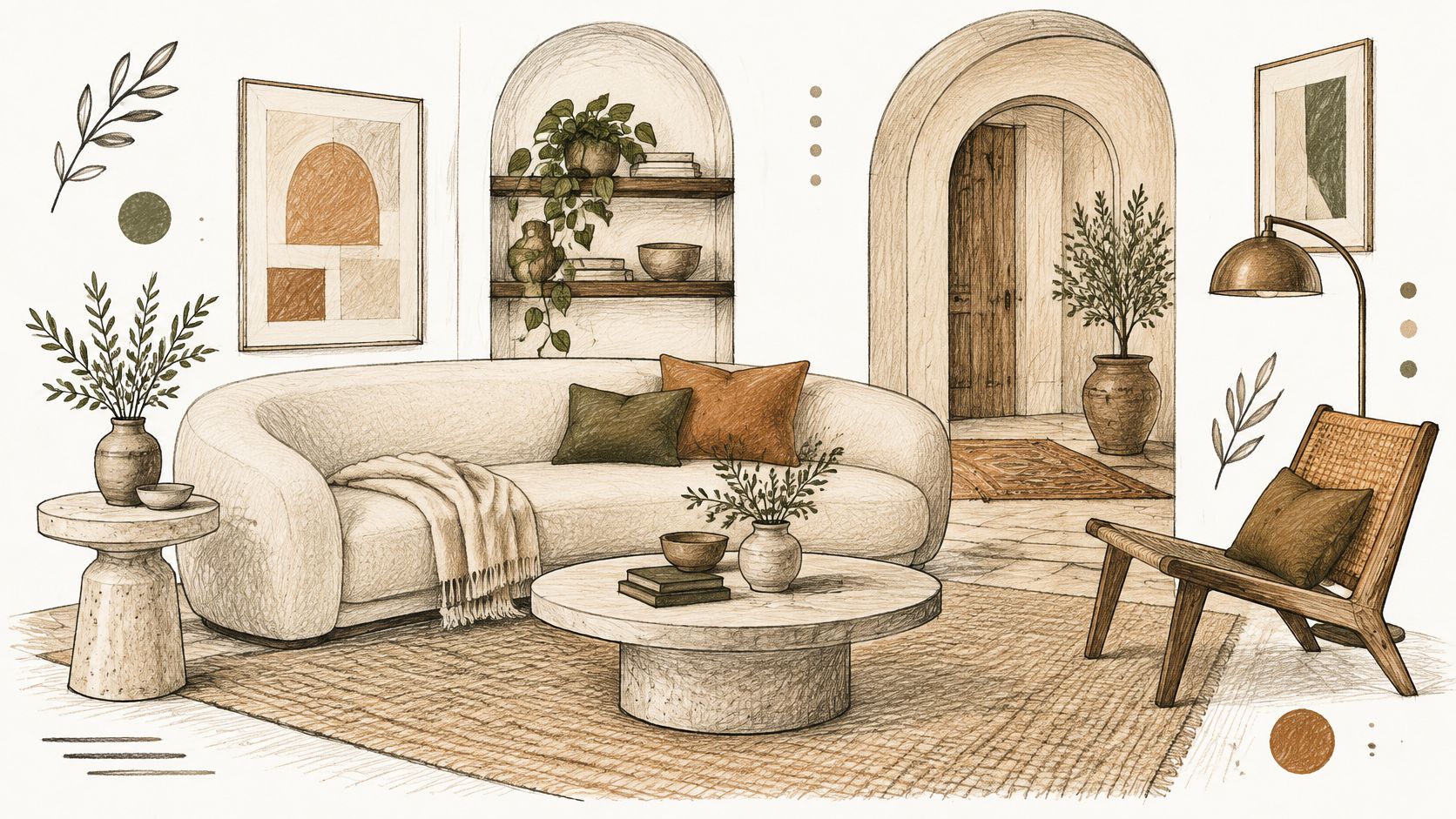
Kitchens and baths are where the curves meet real construction. Kitchens and bathrooms each represented 24% of renovated rooms in 2024, according to the 2025 Houzz Renovation Trends Survey published by the Decorative Hardwoods Association. An arched opening into a kitchen is a framing decision. A round side table is not. Spend the curve where it changes the room, not on every object.
Name the surfaces in the prompt: limewash, bouclé, travertine. "Organic" alone returns generic beige. Put alternative wall finishes beside the source photo and keep the sofa and the arch fixed, so you're judging plaster, not a new layout. A short animation across the day shows whether the limewash stays legible after the sun moves off it. If the texture dies in shade, add a wash light before you approve the finish.
4. Transitional Design
Transitional work is the middle path clients ask for when traditional feels stiff and pure modern feels cold. Classic proportion stays. Simple lines replace carved excess. One traditional move and one modern move per room is the balance I trust. Crown or a paneled door plus a plain metal sconce. A skirted chair plus a thin-legged table. Two antiques plus two sculptural lamps and the room tips into a showroom mix.
Budgets don't share one number, so the finish package has to flex. The overall median renovation spend fell from $24,000 in 2023 to $20,000 in 2024, while small major kitchen remodels increased 9% to $35,000 and small primary-bathroom remodels increased 13% to $17,000. In the UK, median renovation spending rose 26% to £21,440 in 2024, per Houzz. You can't specify the same stone in both markets and call it the style.
Keep the molding. Change the light and the upholstery. That's usually the whole shift.
Use a geometry reference so existing casings and room proportions survive the render. Virtual staging on a photo of the room lets you test a traditional sofa against a modern one without inventing a new plan. Then put two or three finish packages side by side: same layout, different metal, paint, and textile. A design guide for Bay Area homes is a useful furniture check once the packages are narrowed. Suburban houses that keep their moldings and only update lighting are the clearest built examples. Hotel lobbies do the same trick at a larger scale, and they fail the same way when every surface tries to be both old and new.
5. Mid-Century Modern Revival
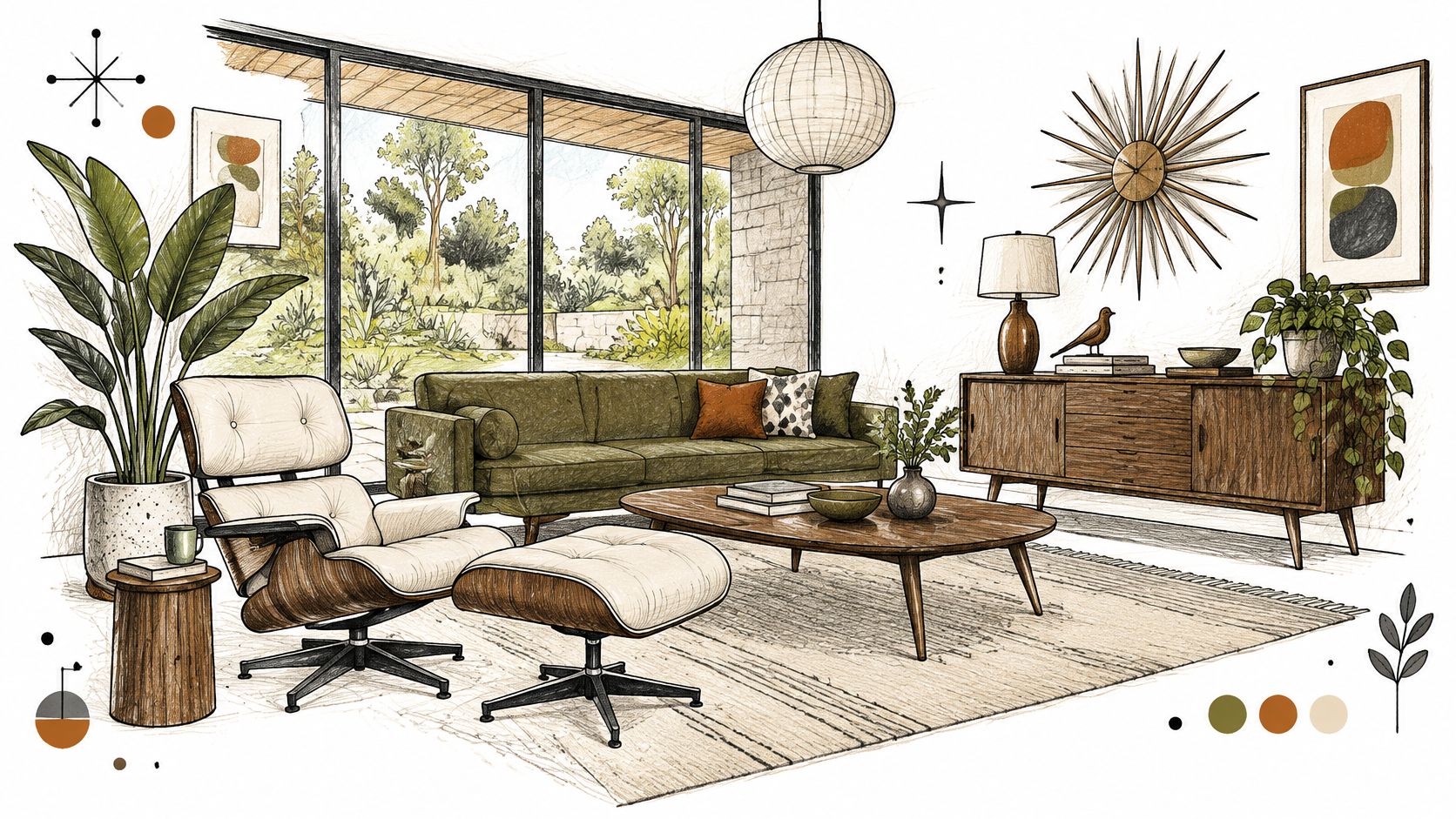
The source years run roughly from 1945 to 1969, when designers chased function, long lines, and then-new materials such as molded plywood and fiberglass. The Eames House, Case Study House No. 8, built in 1949 in Pacific Palisades, is still the clearest lesson: a light frame, a strong indoor-outdoor line, and furniture that doesn't block the glass. Restored houses in Palm Springs keep that open plan and the period pieces, and they look wrong the moment the palette turns into a rainbow of "retro" accents.
Limit color to two accents plus neutrals. Walnut, teak, olive, and a rust textile will carry a living room. A third accent, plus a patterned rug, plus colored glass, collapses it into a theme party.
Open plan, then the chair
Name the wood in the prompt: walnut veneer or teak, not "warm wood." On an open plan, compare furniture arrangements for sightlines from the entry to the glass. A lounge chair that blocks the axis ruins the style even if the chair is correct.
Object removal plus style transfer is the clean test for a vintage piece against contemporary art. Pull the old sofa out of the photo, drop in the chair, and see whether the art still has wall. If you're unsure whether a photo mockup is enough for the client, read virtual staging versus real staging before you promise a furnished shoot.
6. Warm Minimalism
Strict white-box minimalism photographed well and lived poorly. Warm minimalism keeps the reduced forms and adds a tactile wall, a warmer floor, and light that isn't blue at night. Urban apartments do it with microcement, oak, and concealed kitchen storage. Boutique hotel rooms do it with indirect light and almost no hardware on view. Both fail when a fifth material sneaks in "for interest."
One wall, one floor
Choose one textured finish for walls and one for floors, then stop. Plaster and oak. Microcement and stone. A third heroic surface, such as a fluted wood feature plus a busy rug, undoes the edit.
Kitchens hide in this style, so the test is evening, not the hero daylight shot. Set lighting controls for color temperature and an evening scene before you approve a paint. Cool 4000K light will make a warm plaster look dirty. Render enhancement helps you see the difference between two plasters that look identical in a small preview.
Share one sequence of the same room across the day, not six different layouts. Clients approve faster when the furniture doesn't move and only the light does. For the living zone specifically, a living room staging pass on the empty photo keeps the windows fixed while you try a lower sofa and a single floor lamp. If the lamp is doing all the warmth, the wall color is still too cold.
7. Wabi-Sabi Interiors
Wabi-sabi values imperfection, age, and objects that show the hand. In a house that means hand-troweled plaster, reclaimed timber, irregular ceramics, and asymmetry you planned, not a pile of unfinished work. It is the counterpoint to uniform modern finishes, and it suits clients who want character more than a catalog match. Teahouse-like restaurant rooms use the same moves: uneven plaster, a low table off center, and almost no shine.
Specify the surface, or the render will sand it smooth. Write "hand-troweled plaster" and "aged brass," not "rustic." An atmosphere reference taken from a quiet photograph controls the light better than adjectives like soft or calm.
Irregular is not the same as unfinished. Every object still needs a place, and the wear has to be in the material, not in the housekeeping.
Mask one object at a time. Swap a bowl, a textile, or a stool while the walls and openings stay. Then lay out several arrangements of those same objects and compare them. The version that balances usually puts the heaviest piece off the centerline and leaves a clear stretch of floor. If every corner is filled, you've left the style.
Say the client loves a chipped rim on a bowl but hates a scuffed floor. Show both in separate masks. Approve the ceramic, specify a finish that can be repaired on the timber, and don't let a single "aged" prompt weather the whole room.
8. Sustainable, Material-Focused Interiors
This style is a procurement decision wearing a visual one. You specify low-impact, repairable materials and a healthier indoor environment, then you show the client what that choice looks like next to the cheaper default. The Bullitt Center in Seattle, by Miller Hull, was built to the Living Building Challenge and remains a clear large-scale reference. At house scale, the move is quieter: keep the existing timber floor, specify a low-VOC finish, and stop demo that the design doesn't need.
Residential interior design is a large enough market that these specs are no longer a side conversation. It was valued at approximately USD 56.7 billion in 2025 and is forecast to reach USD 86.7 billion by 2033, a projected 5.5% compound annual growth rate, with India expected to grow fastest at country level, according to Grand View Research. Clients asking for lower lifecycle cost sit inside that demand, not outside it.
Compare the substitute, not the slogan
Put low-impact alternatives beside the source image and record cost and appearance in the same note. A material reference lets you test reclaimed wood and recycled finishes before anyone writes a purchase order. Document the source next to each render so a certification review isn't reconstructing your intent from a JPEG.
- Keep the frame: Walls and openings stay. Only the finish changes, or the comparison is useless for pricing.
- Name the substitute: "Existing oak, water-based finish" beats "eco floor."
- Cap the exploration: When a team is testing many options, track generation cost against a shared balance and a per-person cap so the study doesn't outrun the spec.
A room that reuses the floor and changes only the paint and the textile is often the better designer home interior. New everything, even in approved materials, can raise impact while looking less specific to the house.
How the eight designer home interior styles compare
| Item | Signature Materials | Typical Palette | Best For |
|---|---|---|---|
| Biophilic Design | Wood, stone, rattan, plants | Natural greens and earth tones | Nature-connected, wellness-focused homes |
| Japandi | Natural wood, handmade ceramics, linen, paper | Warm white, beige, charcoal, soft green | Calm, uncluttered spaces |
| Organic Modern | Limewash, raw stone, jute, wood | Sand, clay, sage, warm white | Warm, contemporary family homes |
| Transitional Design | Wool, cotton, velvet, brass or bronze | Neutrals with brass, bronze, or deep blue accents | Timeless homes blending traditional and modern styles |
| Mid-Century Modern Revival | Teak, walnut, rosewood, brass or chrome | Mustard, olive, teal, burnt orange, neutrals | Modern homes with retro character and iconic furniture |
| Warm Minimalism | Plaster, microcement, boucle, stone | Warm white, greige, camel, oatmeal | Calm, comfortable apartments and boutique spaces |
| Wabi-Sabi Interiors | Handmade ceramics, weathered wood, patinated metal, natural stone | Clay, ash, moss, charcoal | Character-rich spaces that embrace imperfection |
| Sustainable, Material-Focused Interiors | Reclaimed wood, recycled textiles, locally sourced stone, low-VOC finishes | Natural, material-led tones | Healthier, lower-impact homes designed for longevity |
Choose a Direction and Test It Before You Build
Pick the style whose materials and layout logic fit the architecture you already have. A low Japandi horizon fights an eight-foot traditional ceiling unless you commit to the furniture line and leave the crown alone. Biophilic planting fails in a room with one small window unless the daylight test says otherwise. Mid-century color fails when a third accent shows up in the rug. The style is the constraint, not the shopping list.
I narrow to two or three finish packages and compare them on the same photo or model view before anyone orders stone, fabric, or millwork. Same camera, same openings, different surfaces. That is the difference between a mood board and a decision. Packages that only look good from a new camera angle are hiding a problem in the actual room.
U.S. remodeling is large and it moves. Harvard University's Joint Center for Housing Studies, as summarized by the University of South Alabama, projected homeowner improvement and repair spending to decline from about $481 billion in 2023 to $450 billion in 2024, roughly 6.5%, the first annual contraction since 2010, with the downturn expected to worsen through the third quarter of 2024 before moderating. A softer year is a bad time to discover the wrong oak after it's on site. Testing is cheaper than restocking.
mnml.ai is an AI studio for architectural design visualization. Once a direction is settled, Studio is where you refine one interior from a sketch, a photo, or a model view, with lighting, materials, and masked edits beside the render. Flow is where you put up to four alternatives next to the source so the client compares finishes instead of collecting loose images. If you also need a furniture-layout check from a furnishing studio, compare furniture layouts with renderings against those same frames before you lock an order.
Bring the architect the package that survived the test: palette, layout notes, and the frames that kept the original geometry. That's the set worth pricing.
mnml.ai turns a room photo, a sketch, or a model view into interior visualizations you can revise, compare, and present before construction. Use it to test the palettes and layouts in this guide on the home you have, then take the frames that hold up into the client review. Start with a project at mnml.ai.