8 Design Concepts Examples and the Decisions Behind Them
Explore 8 design concepts examples, from biophilic and parametric design to universal design, with the context, trade-offs, and decisions behind each one.
You're preparing a concept presentation, and the images look convincing. Then the client asks why the courtyard sits there, why the façade needs that geometry, or whether the planted balconies can be maintained. A concept name alone won't answer those questions.
The most useful design concepts examples connect an idea to decisions about space, construction, operation, and experience. Biophilic design might justify moving occupied rooms toward a garden. Modular design might require fixing the structural grid before refining the façade. Neither works as a label applied after the plan is finished.
For your own project, keep a simple chain visible:
- Context: What site condition or user need prompted the concept?
- Decision: What did the team change because of it?
- Evidence: What drawing, test, or comparison would justify that change?
The examples below treat each concept as a working commitment, not a visual style. Some require technical modeling; others depend on surveys, prototypes, or conversations with users. All require you to show what you've gained, what you've compromised, and what still needs verification.
1. Biophilic Design
A planted atrium can look persuasive while leaving the surrounding rooms dark. Biophilic design becomes useful when you coordinate planting, daylight, natural materials, and views with the spaces people occupy.
Bosco Verticale in Milan and the Amazon Spheres in Seattle are recognizable references for integrating vegetation with architecture. For a smaller project, though, a courtyard visible from everyday circulation may be a more appropriate starting point than a densely planted envelope.
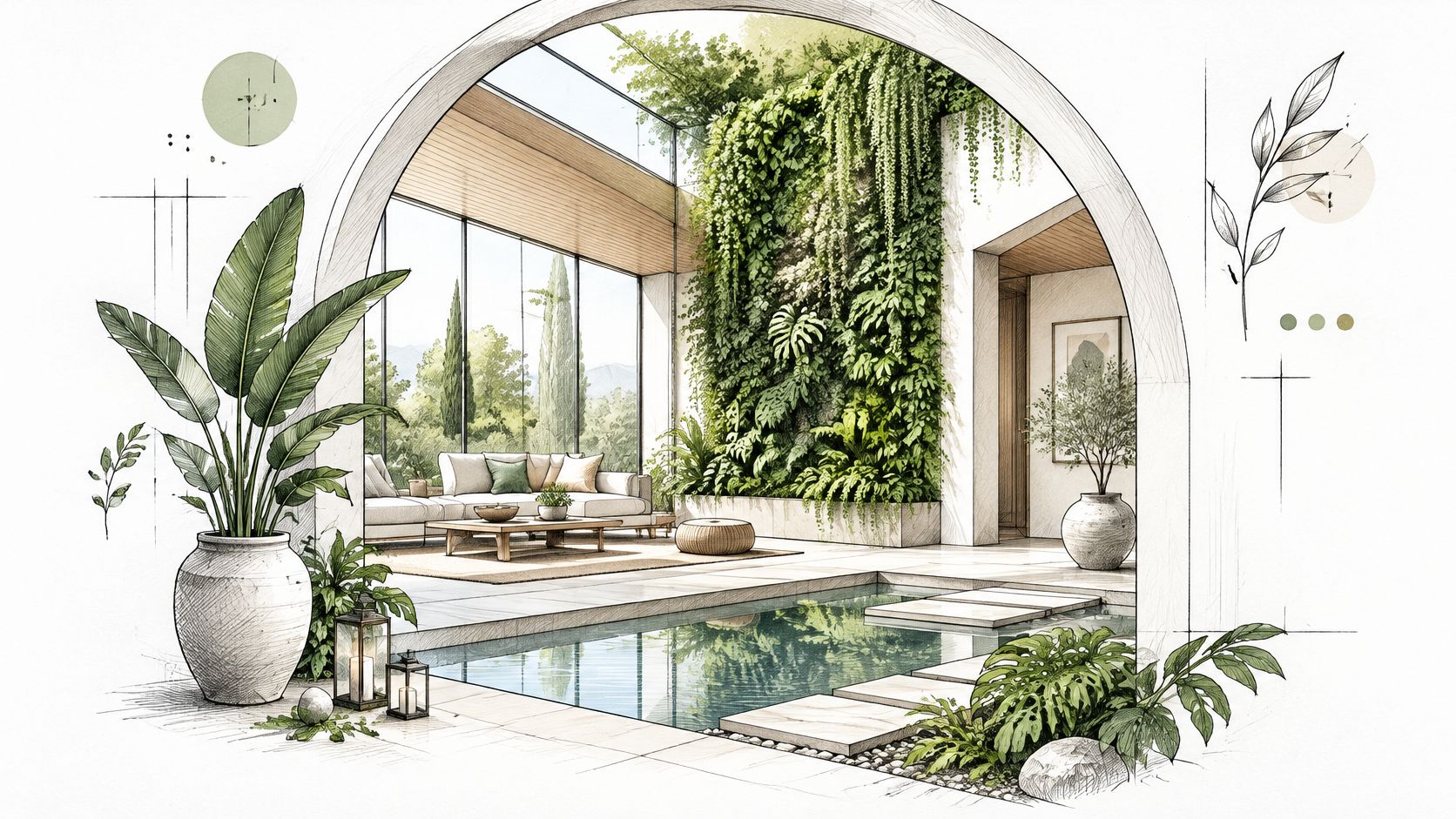
Say you're designing a workplace around an internal garden. Start by placing desks, shared tables, and circulation where people can see it, then check whether the planting competes with daylight or usable floor area. Resolve irrigation, drainage, maintenance access, and replacement routes before treating the garden as a settled feature.
Present the living system, not just the greenery
Show planting at installation and at intended maturity. A mature canopy changes views, shade, and the perceived enclosure of a room, so it belongs in the concept comparison.
- Compare daylight: Keep the camera fixed while testing planting density and roof openings.
- Expose maintenance: Annotate access routes, planters, drainage, and servicing zones.
- Show material character: Pair room views with close-ups of timber, stone, and other specified finishes.
AI tools for reimagining living spaces can help explore atmosphere, but an appealing image doesn't establish whether a plant will thrive there. Ask the client to approve the spatial relationship and maintenance commitment, not merely the amount of green in the render.
2. Parametric Design
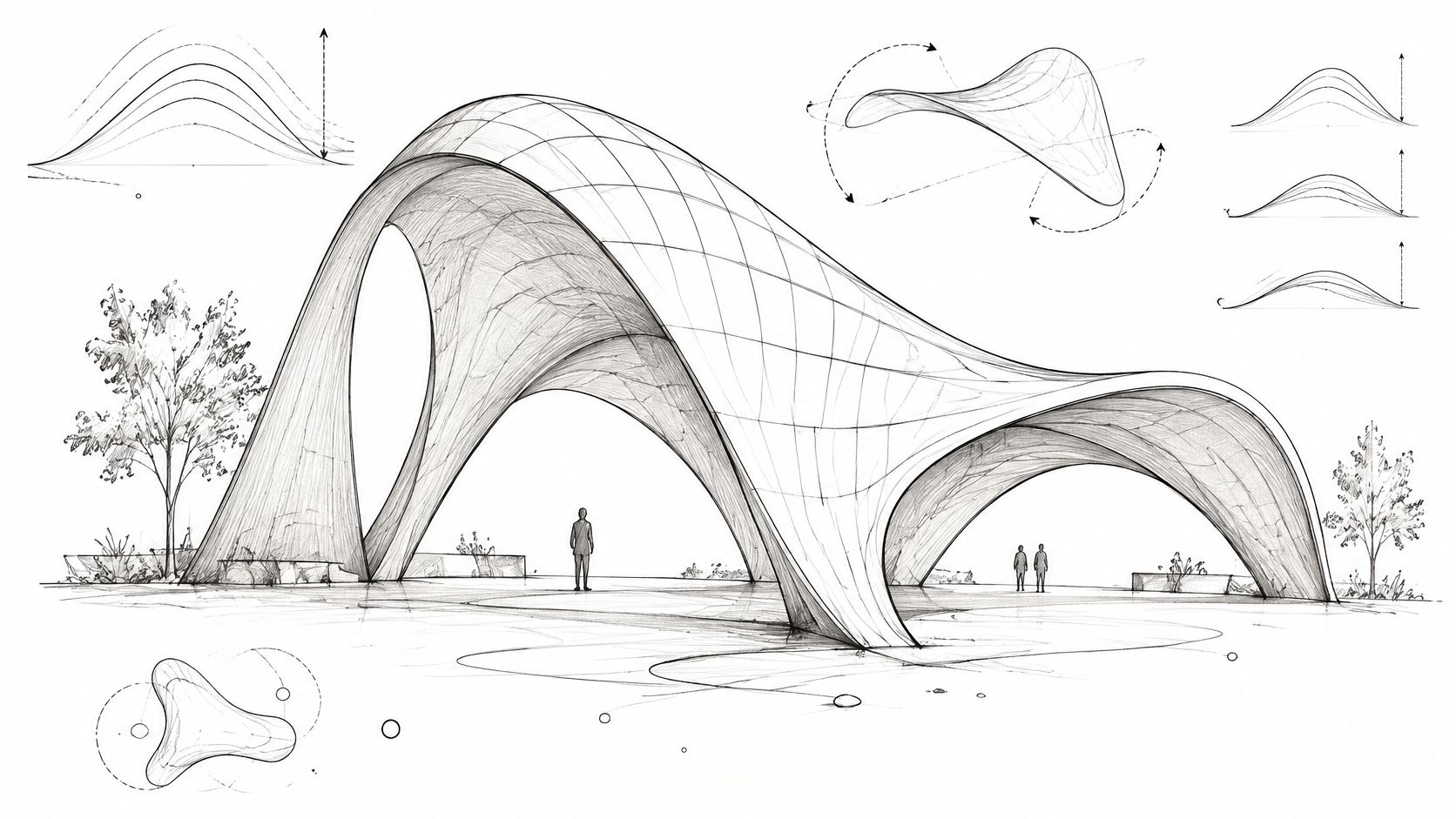
Parametric design means defining relationships, not drawing curves. A façade can be parametric because its shading depth responds to orientation, even when every panel is rectangular.
The fluid surfaces of the Heydar Aliyev Center and the modeling traditions associated with the Sagrada Família offer formal references. For a practical project, a more useful exercise might be a school façade whose fin angle, spacing, and projection remain adjustable.
A Tongji University recreation-center study identified a 45-degree shading-fin strategy through energy simulation, sensitivity analysis, and optimization, then translated it into a façade prototype. The important lesson is the connection between a controllable variable and an architectural decision, not the transfer of that angle to another building.
Keep the inputs understandable
Use Grasshopper to expose the variables that matter, then constrain everything else. If every slider changes simultaneously, neither the team nor the client can explain why an option performs differently.
For site-led schemes, choose 3D landscape design software that lets you coordinate terrain, planting, and architectural geometry rather than comparing disconnected models. Keep the underlying site information consistent across alternatives.
Practical rule: If you can't explain which input changed and why, the option set isn't ready for a client decision.
Present matching views beside the source geometry and relevant simulation output. Include the fabrication consequence too: a subtle visual improvement may introduce unique connections, awkward tolerances, or difficult replacement parts. Choose complexity only when the benefit survives that discussion.
3. Adaptive Reuse
Tate Modern and the High Line illustrate different reuse strategies: adapting an existing enclosure and repurposing existing infrastructure. The transferable question is what to retain, what to remove, and where a new intervention earns its place.
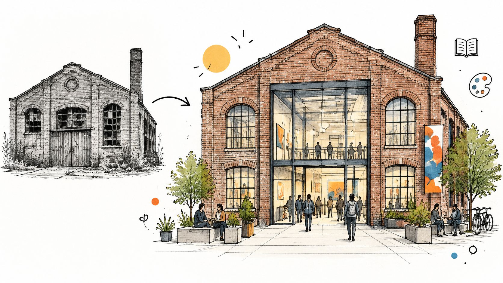
For a warehouse-to-gallery proposal, begin with a measured survey, photographs, and structural investigation. Map the useful qualities of the existing building alongside its constraints: roof spans, floor levels, masonry condition, servicing routes, and opportunities for daylight.
Don't assume every old element deserves preservation. A retained wall that prevents a workable entrance or creates unresolved moisture problems needs a clear justification.
Make the intervention legible
A convincing presentation separates existing fabric, proposed work, and unverified conditions. Use matched photographs and proposed views, supported by a demolition-and-retention plan rather than relying on atmosphere alone.
- Retain deliberately: Identify the structure, surfaces, and spatial qualities that support the new use.
- Intervene precisely: Test an entrance, rooflight, or glazed insertion without changing the surrounding building.
- Show uncertainty: Flag concealed structure and suspect materials instead of rendering them as resolved.
A photo-rendering workflow is useful for testing interventions against an existing façade. Keep the original photograph beside the proposed image so clients can distinguish the actual condition from the design suggestion.
The trade-off is often between spatial freedom and retention. Preserving a structural grid may constrain gallery dimensions, while removing it may undermine the reuse strategy. Show that conflict directly, including an alternative you rejected and the reason it failed.
4. Passive House (Passivhaus) Design
Choose Passive House when you're prepared to coordinate the building around energy performance, comfort, and envelope continuity. It isn't a façade treatment, and it can't be established by adding insulation to an otherwise unresolved concept.
Consider a compact apartment building with generous glazing. The team must coordinate orientation, window specification, external shading, insulation, airtightness, thermal bridges, and ventilation with heat recovery. Changing the window area affects more than elevation composition; it changes the assumptions the energy model must test.
Separate performance intent from proof
Present the envelope in section, not just in perspective. Show how insulation continues around window openings, where balconies meet the structure, and how ventilation equipment can be accessed for maintenance.
A useful evidence-based presentation compares environmental outcomes rather than assuming that a brighter image represents a better building. In a Dhaka educational-building case study, an optimized façade and energy concept increased spatial daylight autonomy from 46% to 76.3% and reduced daylight-glare probability from 44.6% to 11.3%. That wasn't a Passive House certification result, but it demonstrates why daylight and glare deserve separate checks.
For your proposal, show winter and summer conditions from matching viewpoints. Pair those images with the project's energy calculations and a section through the most demanding junction.
A render can explain an envelope strategy. It can't verify airtightness, thermal performance, or certification.
The compromise might involve deeper window reveals, less glazing on an exposed elevation, or space reserved for ventilation distribution. Explain those choices before the client approves an image that depends on removing them.
5. Universal Design
Start at the entrance. If a wheelchair user must take a service route while everyone else enters through the main door, the design hasn't resolved equal access just because a ramp appears somewhere on the plan.
Universal Design asks you to make environments usable by a broad range of people from the outset. OXO Good Grips offers a useful product reference: a handle's usability matters as much as its appearance. In architecture, apply that attention to doors, controls, circulation, seating, lighting, and wayfinding.
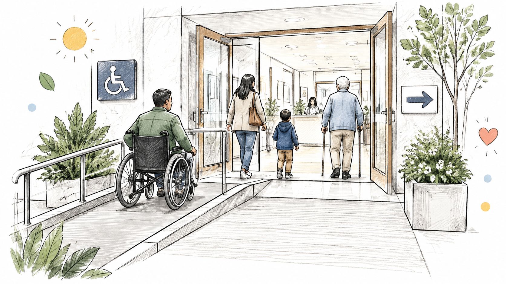
For an apartment lobby, trace the route from pavement to entrance, reception, lift, and shared facilities. Check it with doors open, furniture occupied, and deliveries arriving, not just as an empty circulation diagram.
- Test movement: Draw clearances and maneuvering areas using the applicable accessibility requirements.
- Test perception: Review signs, contrast, glare, and controls from different seated and standing viewpoints.
- Test operation: Consider door effort, reach, resting places, and the sequence of actions needed to enter.
Furnish the route before approving it
A generous room can become difficult to move through once chairs, side tables, and storage arrive. A living-room staging workflow can help communicate furniture arrangements, but retain a dimensioned plan as the authority for clearances.
The trade-off isn't always more space versus less space. It may be a different door swing, a clearer furniture layout, or a less reflective finish. Present those changes as ordinary design quality, while keeping regulatory review separate from the visual presentation.
6. Modular and Prefabricated Design
Habitat 67 is a useful reference for thinking beyond a repeated box. Modular design combines repeatable components with decisions about stacking, access, outdoor space, and identity. Prefabrication describes how elements are made; it doesn't dictate a single architectural expression.
For a hotel concept, begin with the room module, structural system, service connections, and corridor arrangement. Then test transport, lifting, assembly access, and the relationship between factory work and site-built construction.
The uncomfortable decision comes early: how much must be fixed before production planning can proceed? If the client expects continuous layout changes, explain which alterations would affect the manufacturing strategy.
Show assembly as part of the concept
Use an exploded axonometric and a site sequence alongside the finished render. Clients need to understand how the proposal arrives and connects, not only how it looks after landscaping.
- Standardize selectively: Repeat wet areas, connection details, and structural interfaces where practical.
- Vary with purpose: Use orientation, entrances, shading, and planting to distinguish places without multiplying component types.
- Check site logistics: Show delivery access, lifting positions, staging areas, and adjacent constraints.
Use offsite building timelines and costs to structure the procurement conversation, then evaluate the proposed system against your actual site and supplier information. Don't promise a faster or cheaper project solely because it's prefabricated.
Repetition is useful when it simplifies making, assembling, and maintaining the building. Cosmetic repetition alone doesn't achieve that.
For the client review, compare a highly standardized arrangement with a more varied alternative. Make the consequence visible in module types, junctions, circulation, and outdoor space rather than presenting variation as a free aesthetic choice.
7. Human-Centered Design
A clinic plan may satisfy the room schedule while confusing patients and complicating staff movement. Human-centered design starts with those activities, then uses observation, discussion, prototypes, and testing to improve the proposal.
IDEO's prototyping approach is a useful reference, but the method doesn't require an elaborate workshop. For a clinic reception, ask patients and staff to work through arrival, registration, waiting, consultation, and departure using a plan and simple mock-ups.
A study published in the International Journal of Technology and Design Education developed a design-process assessment scale covering concept development, research and analysis, preliminary design, and design proposal. That distinction is useful in practice: don't assess a polished proposal without examining how the team investigated the problem.
Ask about tasks, not taste
Instead of asking which image users prefer, ask where they'd go first, what they can see from reception, and where a private conversation could happen. Record hesitation and conflicting needs, not just approval.
- Map the journey: Identify destinations, handovers, waiting points, and moments of uncertainty.
- Prototype the difficulty: Mock up the reception counter or room entrance that's causing disagreement.
- Retain the reasoning: Keep source plans, comments, and revisions together so the next review can examine the decision.
The trade-offs become clearer when users discuss actual work. Reception staff may prioritize visibility while patients prioritize privacy; a layout has to address both rather than average their preferences.
Present matching views of the alternatives with the user task beside each. Explain what changed after testing and what remains unresolved. A client can then approve a reasoned direction rather than a loosely defined preference for a warmer or more contemporary interior.
8. New Urbanism and Mixed-Use Masterplanning
A mixed-use district isn't necessarily walkable. Housing above shops won't solve a disconnected street network, hostile crossings, or public spaces that people can't comfortably reach.
New Urbanism and mixed-use masterplanning connect land use with streets, housing types, public space, and everyday destinations. Seaside offers a reference for coordinated town planning, while HafenCity provides a different context for considering mixed uses and public space on former port land.
For a station-area masterplan, start with pedestrian routes between transit, homes, services, and open space. Resolve block structure, crossings, servicing, and changes in level before investing in façade character.
Present the journey at ground level
An aerial image explains the composition, but a street-level sequence reveals the experience. Show how someone leaves the station, crosses the street, finds an entrance, and reaches a sheltered place to sit.
- Test active edges: Distinguish public entrances, occupied frontages, loading areas, and blank walls.
- Test different conditions: Review public spaces in sun, rain, darkness, and seasonal change.
- Test the unfinished district: Show early phases with their actual access, servicing, and temporary boundaries.
The trade-off often involves competing claims on the same ground. Loading, emergency access, cycle movement, planting, drainage, and pedestrian space can't all be resolved by removing vehicles from a render.
Show an operational street section alongside the attractive perspective. Include a quieter period as well as an event-day view, and explain who will manage shared spaces. Clients should be able to judge whether the district will function between the moments selected for the presentation, not only during its most photogenic conditions.
How the eight design concepts compare at a glance
| Item | Core Idea | Typical Setting | Main Trade-off | Best Visualization Focus |
|---|---|---|---|---|
| Biophilic Design | Integrate nature into built spaces to support wellbeing | Workplaces, healthcare, and homes | Wellbeing benefits and sustainability versus maintenance needs and difficult measurement | Mature planting, daylight, views, and natural material textures |
| Parametric Design | Use adjustable rules and algorithms to generate geometry | Complex architectural forms and performance-led projects | Rapid exploration and performance feedback versus technical complexity and build costs | Side-by-side geometry options and parameter-driven changes |
| Adaptive Reuse | Convert existing structures to new uses while retaining character | Heritage, industrial, and infrastructure conversions | Preserves resources and identity versus uncertain conditions and retrofit constraints | Before-and-after views and contrast between old and new materials |
| Passive House (Passivhaus) Design | Minimize building energy demand through a high-performance envelope and ventilation | Homes, schools, and multifamily buildings | Low operating energy and comfort versus higher upfront costs and demanding detailing | Envelope details, seasonal sunlight, and shading |
| Universal Design | Make environments usable by people with diverse abilities | Public buildings, homes, and shared spaces | Broad usability versus design compromises and the need for inclusive expertise | Accessible routes, clearances, lighting, contrast, and diverse users |
| Modular and Prefabricated Design | Assemble buildings from factory-made modules or components | Housing, hotels, and temporary buildings | Faster, controlled construction versus transport limits and reduced dimensional flexibility | Module arrangements, assembly stages, and site-specific fit |
| Human-Centered Design | Iteratively shape solutions around real user needs and feedback | Architecture, interiors, and planning | Better-informed outcomes versus time, research, and facilitation demands | Alternative layouts and prototypes tested with users |
| New Urbanism and Mixed-Use Masterplanning | Create walkable, mixed-use neighborhoods with connected public spaces | Neighborhoods and larger districts | Walkability and place identity versus regulatory, market, and retrofit challenges | Pedestrian-scale streets, public spaces, and development phases |
Turning Eight Design Concepts Into Decisions Clients Trust
Each concept works best when its defining decision becomes visible early: the daylight strategy in biophilic work, the parameter logic in parametric studies, the retained fabric in adaptive reuse, or the step-free route in Universal Design. A convincing concept statement tells the client what the team will prioritize when requirements conflict. It also makes clear what the team won't sacrifice merely to improve an image.
The historical precedent is broader than any particular style. Routledge's account of the Bauhaus describes a program that connected architecture, art, craft, materials, and industrial production. That integrated approach remains useful: visual language belongs in the same conversation as construction, use, and production.
Build a comparison that supports a decision
Choose a primary concept for your next review and list the decisions it forces. Keep the alternatives comparable by holding camera position, drawing scale, surrounding context, and presentation quality consistent.
- State the proposition: Connect the concept to a specific site condition or user need.
- Show the consequence: Identify the plan, section, material, or construction decision it changes.
- Name the compromise: Explain what the preferred option gives up.
- Assign verification: Identify the calculation, survey, prototype, or specialist review still required.
If you're using generated imagery, preserve the source sketch or model view beside each variation. Check that doors, structure, room proportions, material transitions, and access routes still match the proposal. Treat anything the image introduces without design authorization as an unresolved suggestion, not an approved improvement.
At presentation stage, distinguish design intent, tested performance, and speculation. A planted courtyard may be a settled spatial choice while species selection remains open; a shaded façade may be geometrically resolved while its connections still need engineering. Those distinctions let clients approve progress without mistaking a persuasive illustration for complete technical information.
End the review with a recorded decision and a named next action. Select the option, document the reason, and assign the remaining checks before producing another round of images. That's how a concept becomes a reliable basis for design development rather than a presentation theme.
mnml.ai converts sketches and model views into architectural visualizations, with tools for revising images and comparing alternatives beside their sources. Visit mnml.ai to build a comparison set for your next concept review, keeping the original design visible alongside each rendered option.